Choose Year of news to view:
2026 | 2025 | 2024 | 2023 | 2022 | 2021 | 2020 | 2019 | 2018 | 2017 | 2016 | 2015 | 2014 | 2013 | 2012 | 2011 | 2010 | 2009 | 2008 | 2007 | 2006 | 2005 | 2004 | 2003 | 2002
Populations on Average
Friday August 29, 2014 | by IncaWarrior
New Map Stats
In the recent matchmaker update, population counts are sent for each tribe a few times a minute allowing a nifty graph to be created showing each player's progress over the game. That has been taken a step farther on the map statistics page to show a graph of the average population over time for the winning players. The results show some interesting characteristics about some maps with a few highlights shown here.
One note about the graphs - you may see a regular bump appearing in some of the graphs making them not perfectly smooth. This is due to people playing the maps with fewer players than they are designed for with two of the players spectating.
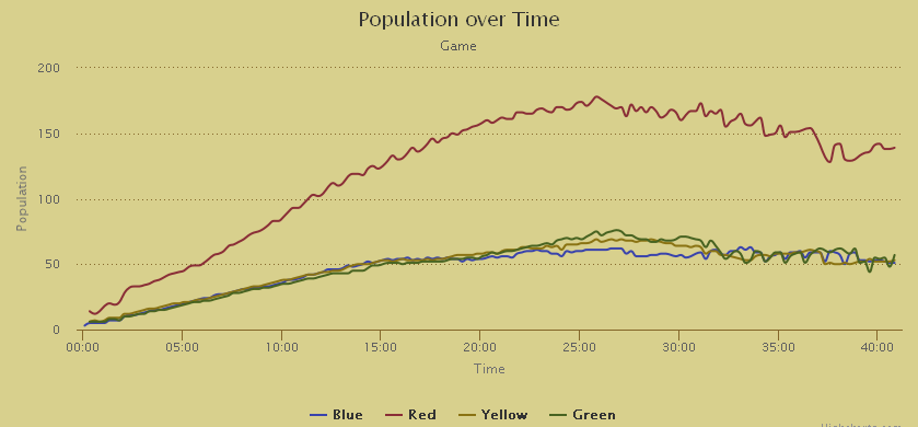
Sessrúmnir Palace
Easily the most popular fan made map, this is a good first example because it is perfectly mirrored for all four teams. There are also no wildmen available to convert at the start, so the population doesn't start growing until the players have built a few huts.
Blue and Red are the typical winners of this map due in part to a bug in the game, but it seems that when yellow and green win, they do it with a slightly higher population.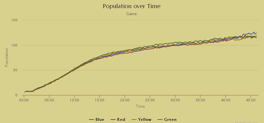
Face Off
The all time most popular map made by bullfrog has a surprisingly large handicap for the Blue player. The start of the game is fairly balanced with a few wildmen available to be converted to the tribe moving to normal growth from huts, but around 10 minutes into the match Blue starts to split off from the other players. The issue is just the amount of space available to build huts. Sure an argument can be made that Blue as host has no lag and there are strong defensive hills around the base, but the overall stats show that this disadvantage definitely gives Blue a harder time.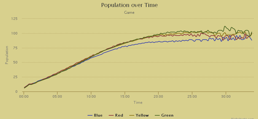
Pressure Point
Another popular Bullfrog map that is much more balanced. A lot of the early game is devoted to converting all the wildmen around the map, which shows up on the population graph as a quick surge up to around 40 braves before a slow growth as the players build enough huts to support that many people!
Another point of interest in this map is the average game length is just under 24 minutes, but the populations plateau at 25-30 minutes. Basically don't expect to get a full base built up before engaging the enemy since most of the time you'll already be dead by then.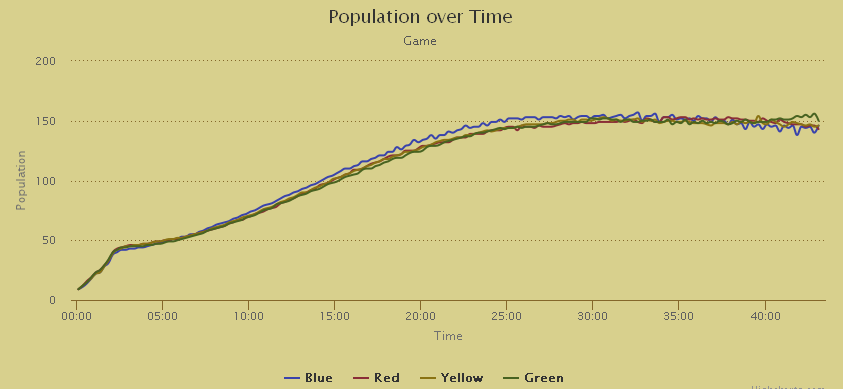
Two On Two

This less popular map by Bullfrog (mostly because of the super powerful spells given from the two stone heads) has quite a range of populations in the later game. The blue tribe gets a bit of an advantage at the start of the game from having more wildmen available and seems to keep that advantage for most of the game.
At around 20 minutes (the average game length) there are two tiers of populations with Blue and Green having a higher population than Red and Yellow. That conveniently matches up with the positions of the tribes where Blue faces Green and Red faces Yellow so Bullfrog might just have known what they were doing when they made the map.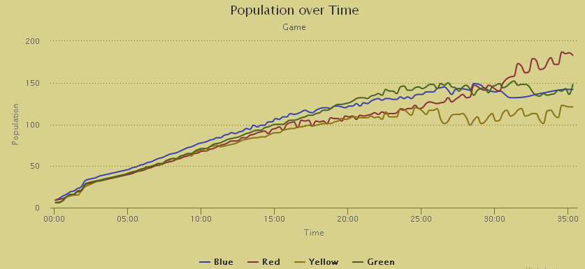
Töm
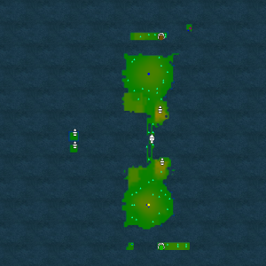
Another popular fan made map has a twist where Red is dependent on Blue and Green is dependent on Yellow. The Red and Green tribes start with nearly no land and no ability to make more, while Blue and Yellow have lots of land and are given the Landbridge spell to make more.
The map is also symmetrical between the teams and it's clear the two teams use a similar strategy in building. Similar to Two On Two (but much more distinct), there are two tiers of population visible. Just after the average game ends at 25 minutes, Green breaks off from Red with more people, so it would seem that Yellow is better at providing their ally with land.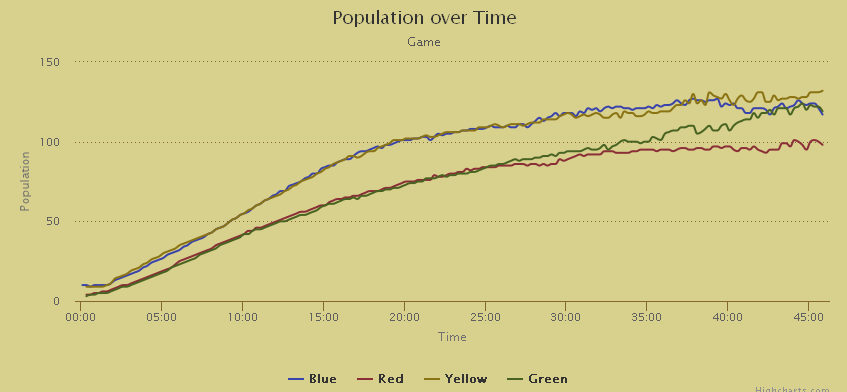
Juggernaut
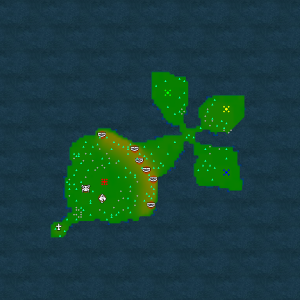
A unique fan made map designed as a three vs one battle with the Red tribe (the juggernaut) having a much larger base and extra mana. The other three tribes all have similarly sized small bases that don't even get up to 75 people each. When Red wins, he gets up to nearly the maximum population which closely matches the combined population of the three players of the opposing team. The three shamans will usually wear him down if the game gets to that stage, so Red really needs to work to keep them down while doing heavy expansion.